New designer wallcoverings land in a steady drip, not an annual flood — a few patterns here, a reissued archive print there, a colorway quietly added to an existing line. Watching them week by week is how you spot where the whole category is drifting before it becomes obvious.
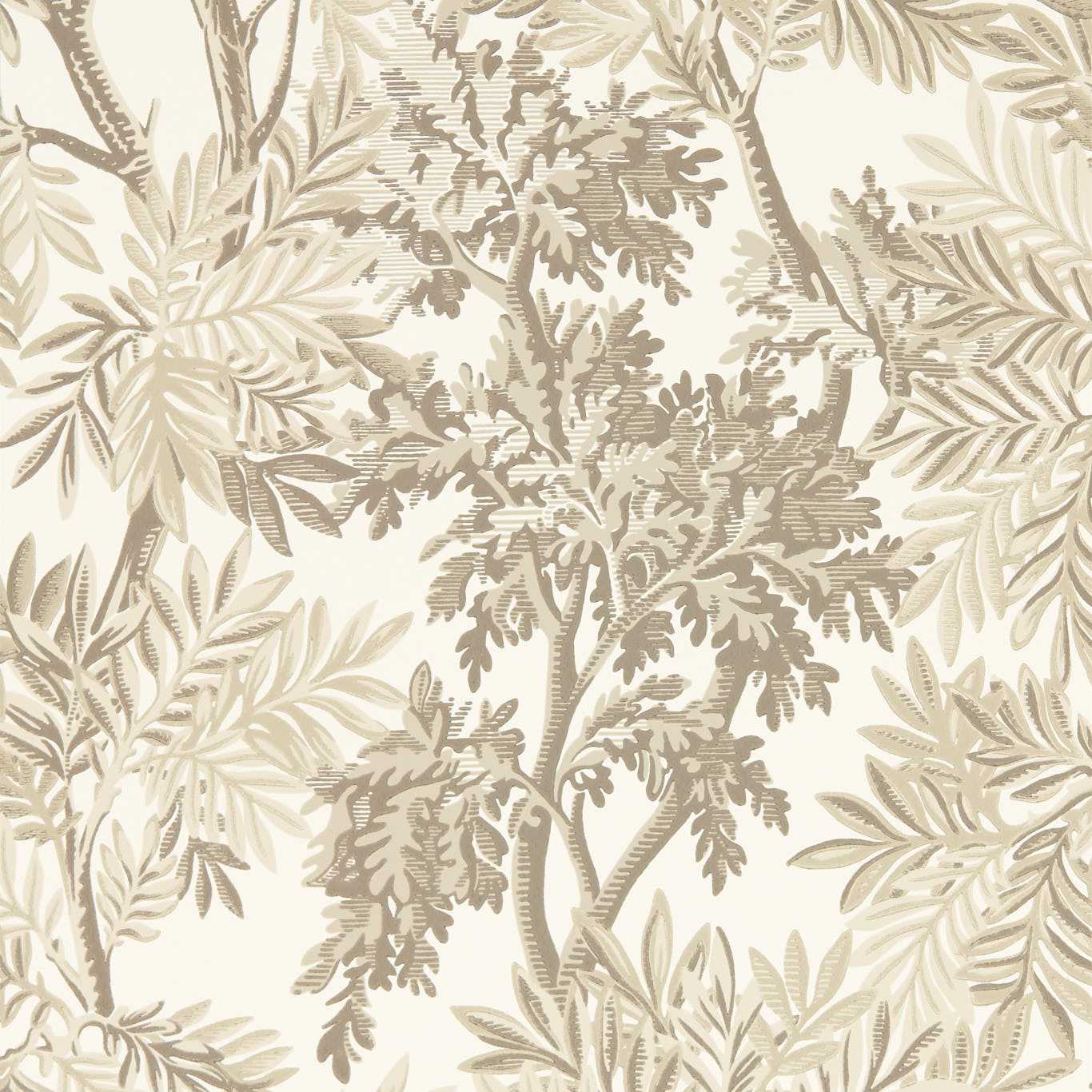
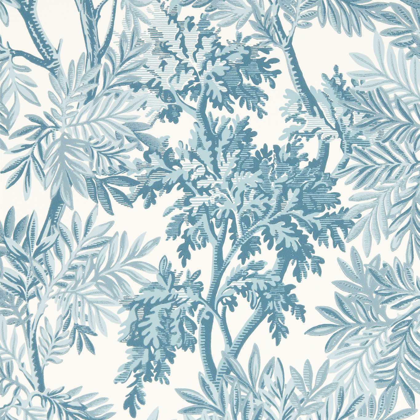
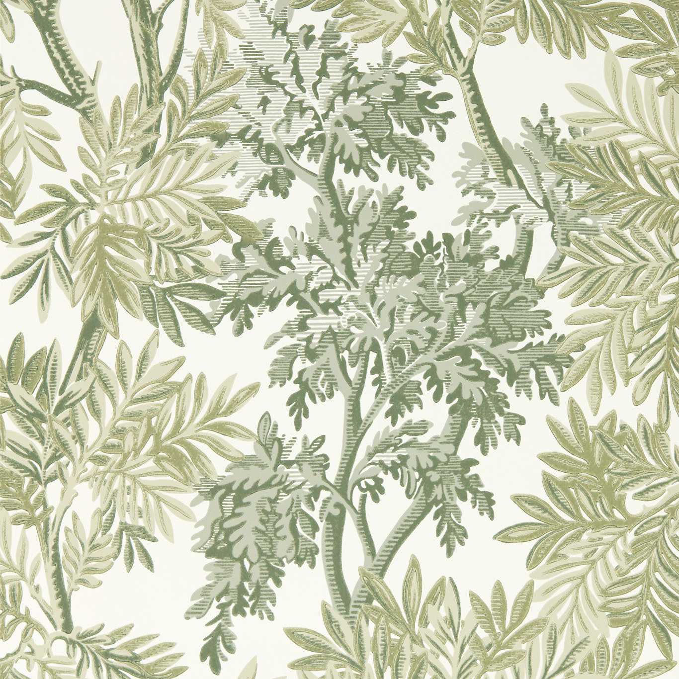
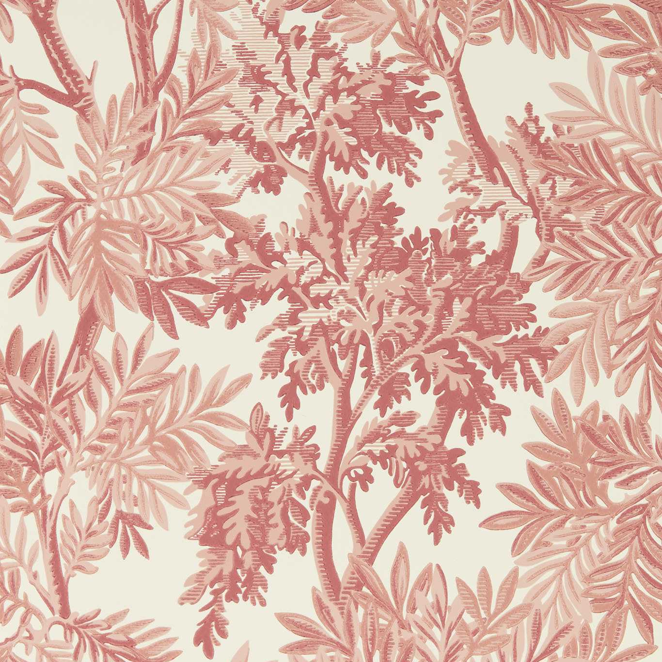
How to read a new-arrivals feed
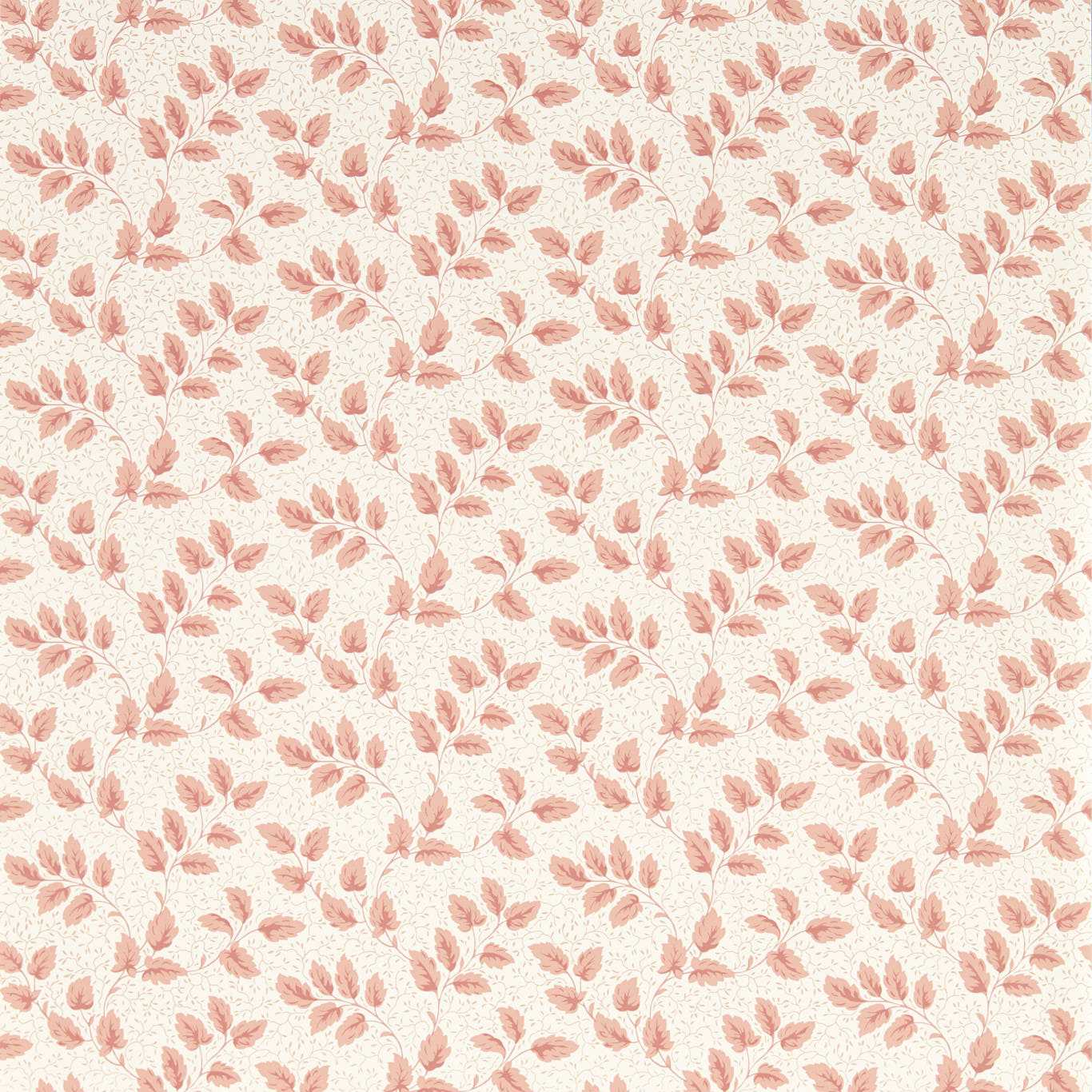
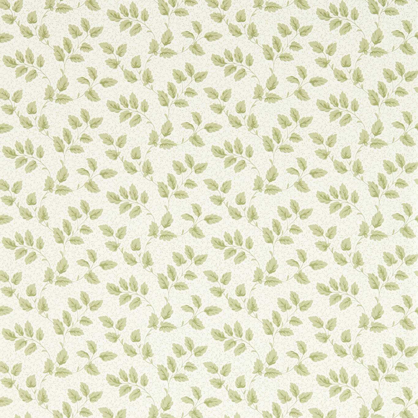
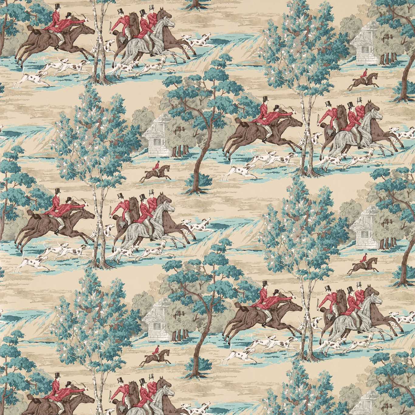
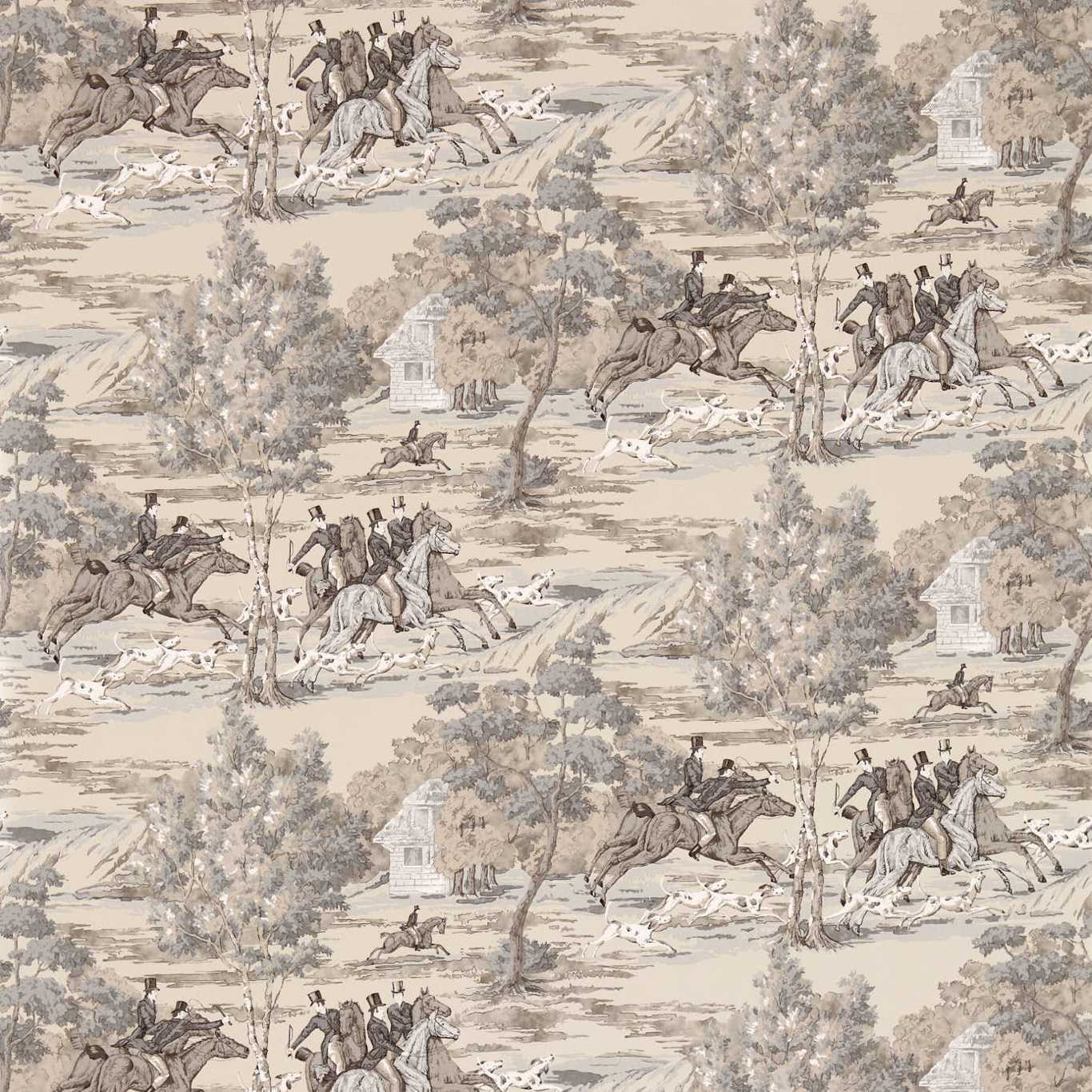
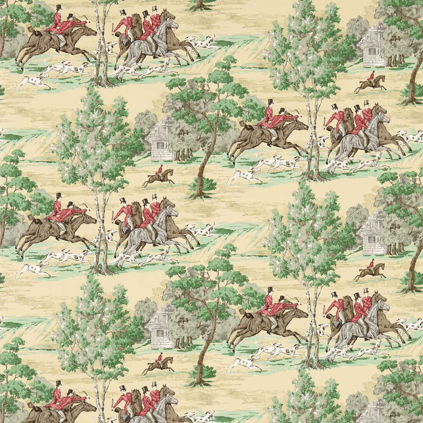
Most new releases fall into a handful of buckets, and naming the bucket tells you what you are looking at. There are genuine new designs, archive reissues pulled from a house's back catalog, recolors of an existing pattern into a fresh palette, and scale changes where a familiar motif is enlarged or shrunk for a different room. A recolor is not a new idea; it is a signal about which colors a maker is betting on this season.
Reading the drip this way turns a scroll into information. When several unrelated houses release warm-neutral grounds in the same month, or when large-scale botanicals start appearing across lines that usually stay geometric, that convergence is the actual trend — earlier and more reliable than any single splashy launch.
What has been recurring lately
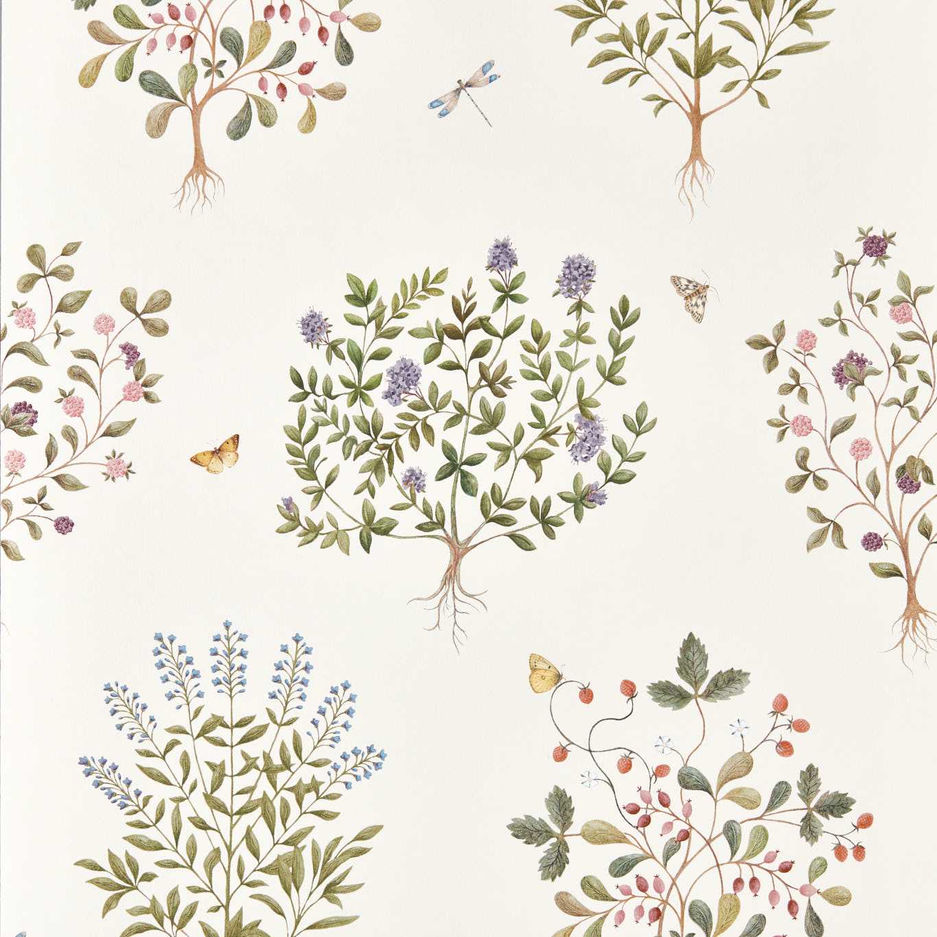
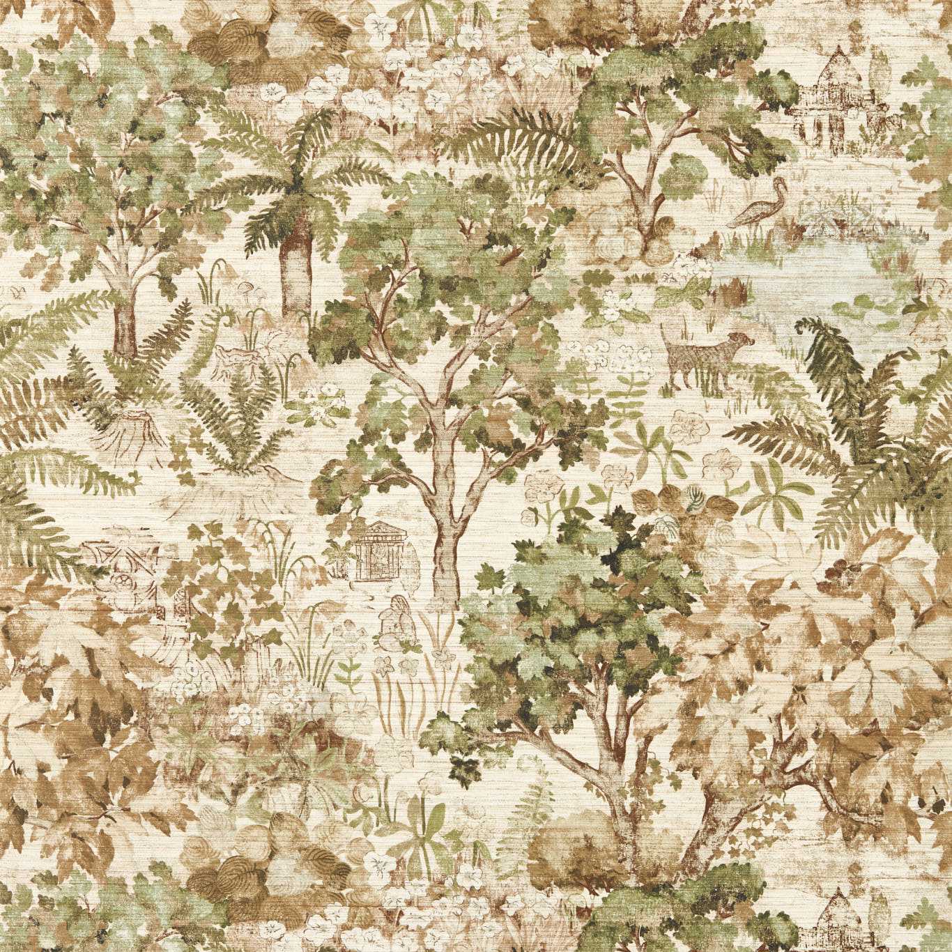
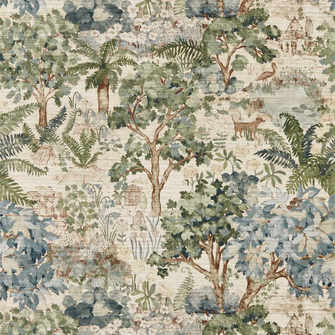
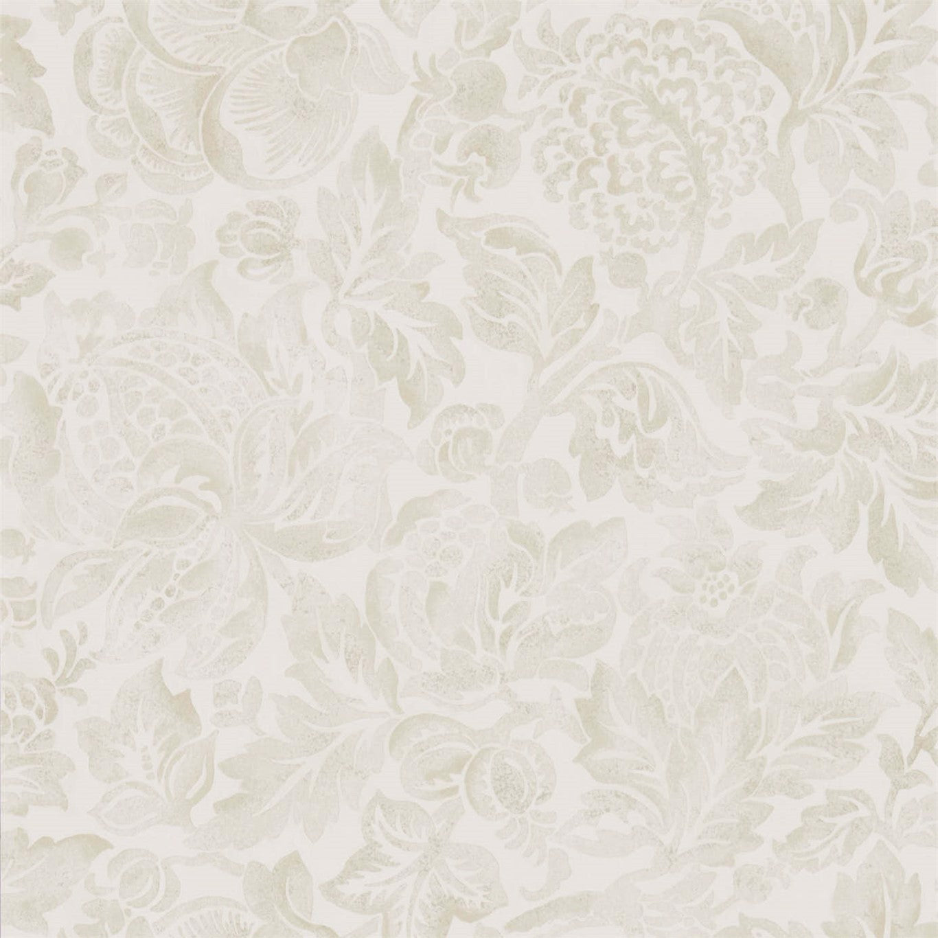
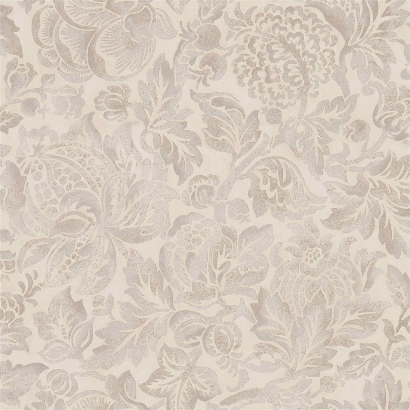
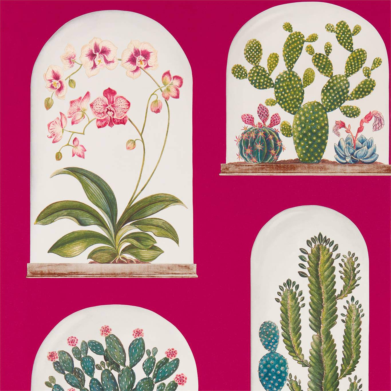
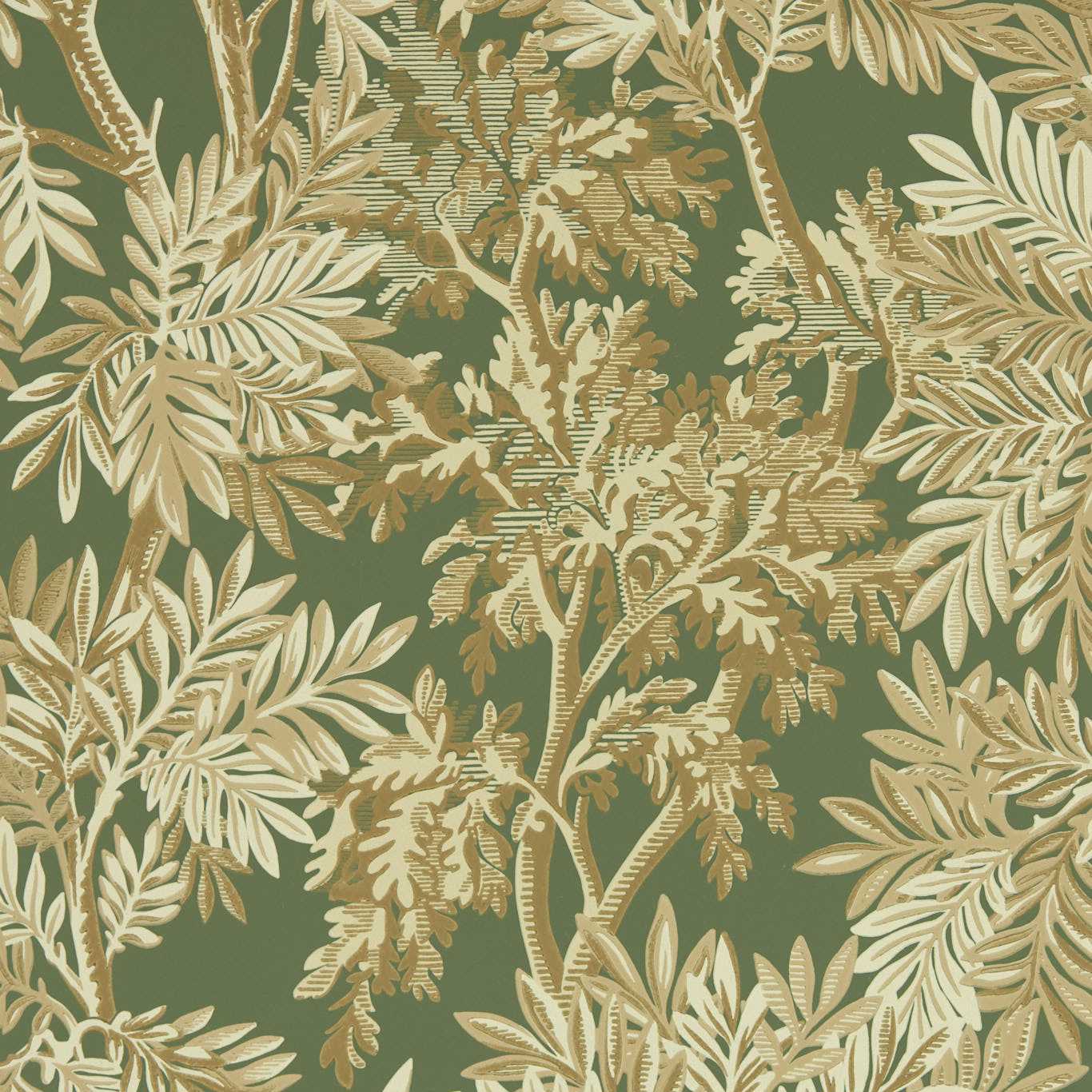
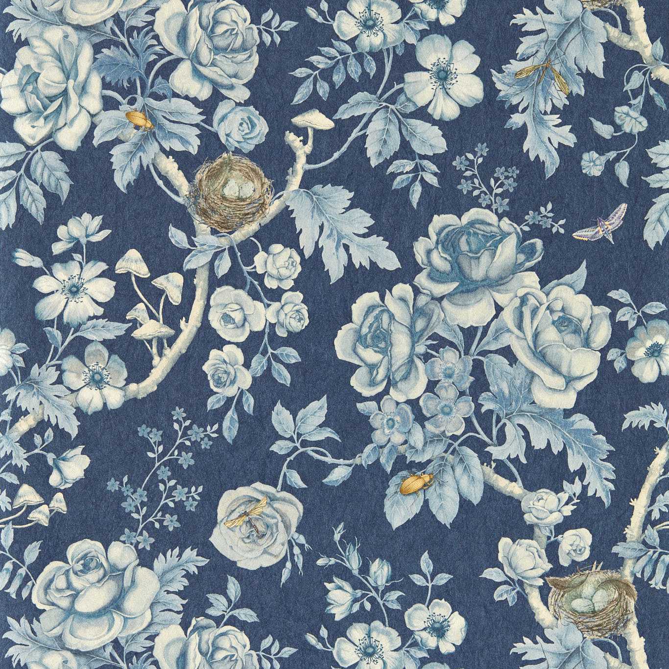
A few directions keep surfacing across new releases. Texture-forward wallcoverings — grasscloth, linen weaves, plaster and mica effects — continue to arrive faster than flat prints, reflecting a broad appetite for surfaces that read as material rather than as image. Alongside them, large-scale nature motifs keep expanding, with botanicals and landscapes rendered big enough to wrap a room instead of decorate it.
Palette-wise, the drift has been away from cool gray toward warmer, earthier grounds, with saturated moody colorways showing up for small rooms. None of this is a hard rule; it is the direction the weekly arrivals have been leaning, and the value of watching is catching the lean while it is still a lean and not yet a cliché.
Turning a trend you like into a wall you keep
A new pattern that photographs well is not automatically a pattern you will live with, and the gap between the two is worth respecting. The most durable choices tend to be the ones with staying power beneath the novelty — a texture, a motif, or a palette you would have liked a decade ago and will still like a decade from now — rather than the release that is exciting precisely because it is unfamiliar.
The practical filter is to separate the trend from the trigger. If a new arrival grabs you, ask whether it is the color, the scale, the texture, or the motif doing the work, then look for that single quality in a form you are confident about. That way the weekly feed becomes a source of ideas rather than a source of regret.
Quick checklist before you order
- Name the bucketNew design, reissue, recolor, or rescale — each means something different.
- Watch for convergenceThe real trend is what several unrelated lines do at once.
- Separate trend from triggerIdentify whether color, scale, texture, or motif is the draw.
- Sample before the hype fadesNew arrivals sell through; order a memo sample early.
- Ask if you'd have liked it beforeStaying power beats novelty for a wall you keep for years.
Frequently asked
How often do new wallcoverings actually release?
Continuously in small batches rather than on one big annual date — new patterns, reissues, and added colorways arrive across the year.
What is the difference between a new design and a recolor?
A new design is an original pattern; a recolor is an existing pattern reissued in a fresh palette, which signals the colors a maker is prioritizing that season.
How do I tell a real trend from a one-off?
Look for convergence — when several unrelated lines move the same direction at once, that is a trend, while a single striking release is often just one house's bet.
Read more
- The reissue economy: why the archive is the busiest studio in the businessSome of the most talked-about patterns of the year are older than the designers selling them. Inside the commercial logic that makes the back catalog the front of the shelf.
- Reading the fairs: what Heimtextil and Maison&Objet signal months before the shelfThe year's directions are visible at two European trade fairs long before they reach a showroom. A field guide to reading them, and the lag between the stand and the wall.
- The color-of-the-year machine, and how a forecast reaches your wallAn annual color announcement travels a long way before it becomes a roll you can buy. A look at the forecasting apparatus, and how much of it you should believe.
- Grasscloth is having a decade, not a momentWoven natural wallcovering keeps returning while flashier trends burn out. Why texture outlasts pattern, and what its persistence says about where taste is going.
- Peel-and-stick grew up: the removable-wallcovering shiftRemovable wallcovering went from novelty to a genuine category. What changed in the material, who is buying it, and where it still falls short of the paste-up original.
- The mural wall: how digital printing changed what a pattern can beFor two centuries a room-wrapping scenic meant Zuber and a fortune. Large-format digital printing broke the repeat, and with it the economics of the custom wall.